
Senior Exhibition Spring 2023
Digital layout, 2022-23
Client: Yang Family University Art Gallery, Indiana State University
Challenge: Create marketing materials for the senior art exhibition (featuring students graduating with a BFA or BA) using a bright, springy color palette.
Solution: Flowing pastels in green and purple that fuse current design trends with art styles of the 1960s.
Postcard process
The final design has a pastel color palette and rounded forms befitting of spring. I chose HWT Arabesque as the font, inspired by Psychedelic lettering.

Postcards in the wild.
Poster process

The first draft of the poster had a Pop Art-inspired six-design format.
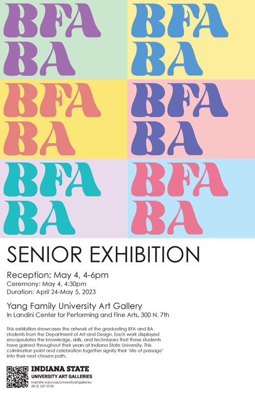
The design was changed because the previous iteration felt “too much like children’s blocks.”

I felt geometric letterforms worked best with the design.
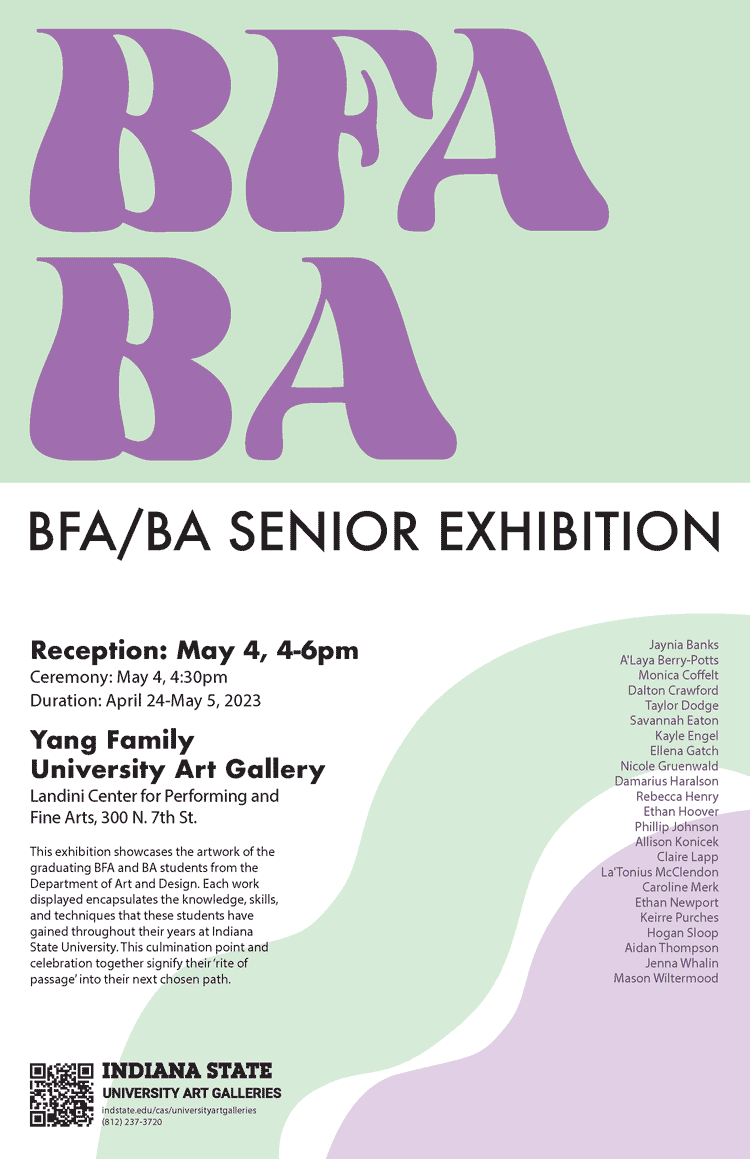
The final poster incorporates non-objective shapes in the bottom right corner to balance out the “BFA BA.”
Vinyl process

The gallery director designed this preliminary draft and asked me to clean it up.

While technically fine, this layout was a bit boring.

Final design, 8 by 8 feet.

The printed vinyl in the art gallery.
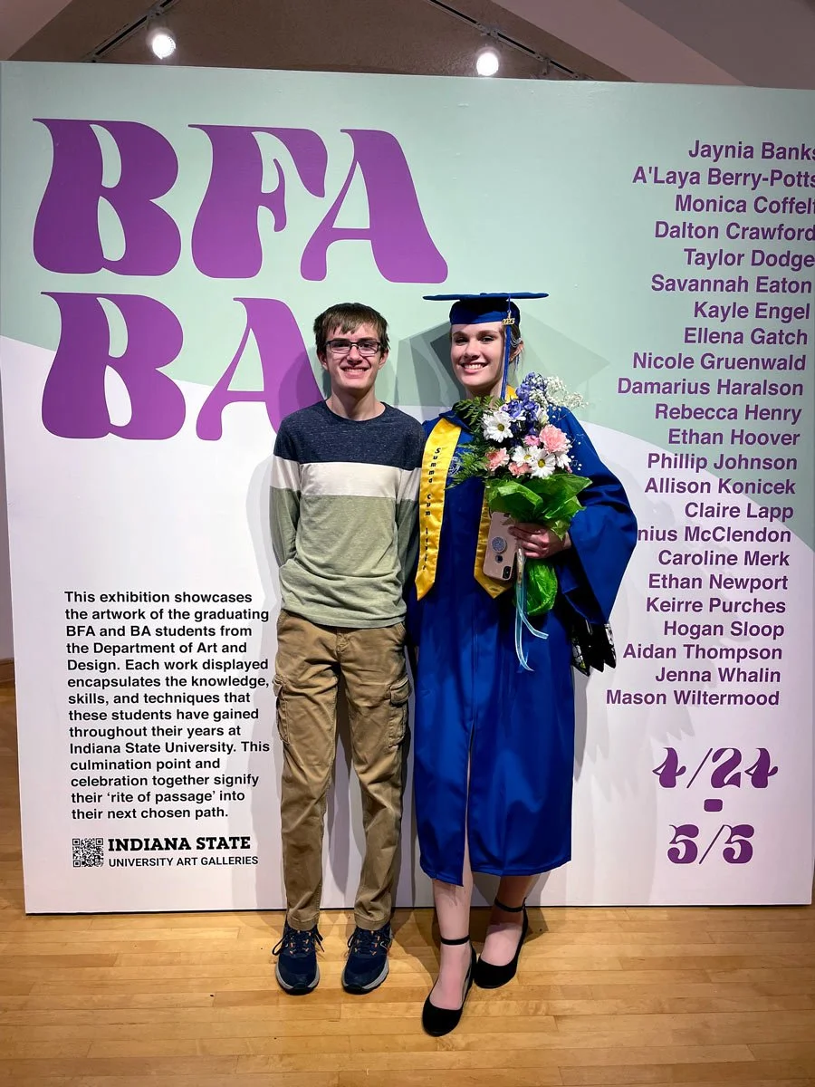
The vinyl turned out to be a popular photo spot.